Basics of ggplot
NOTE
You must turn in a PDF document of your R markdown output. Submit this to D2L by 11:59 PM on September 11th.
Note: This lab has a few “try its” along the way. They are for your own practice and are not required. The lab consists of the three “exercises.”
Our primary tool for data visualization in the course will be ggplot. Technically, we’re using ggplot2; the o.g. version lacked some of the modern features of its big brother. ggplot2 implements the grammar of graphics, a coherent and relatively straightforward system for describing and building graphs. With ggplot2, you can do more faster by learning one system and applying it in many places. Other languages provide more specific tools, but require you to learn a different tool for each application. In this class, we’ll dig into a single package for our visuals.
Using ggplot2
In order to get our hands dirty, we will first have to load ggplot2. To do this, and to access the datasets, help pages, and functions that we will use in this assignment, we will load the so-called tidyverse by running this code:
library(tidyverse)If you run this code and get an error message “there is no package called ‘tidyverse’”, you’ll need to first install it, then run library() once again. To install packages in R, we utilize the simple function install.packages(). In this case, we would write:
install.packages("tidyverse")
library(tidyverse)
Once we’re up and running, we’re ready to dive into some basic exercises. ggplot2 works by specifying the connections between the variables in the data and the colors, points, and shapes you see on the screen. These logical connections are called aesthetic mappings or simply aesthetics.
How to use ggplot2 – the too-fast and wholly unclear recipe
data =: Define what your data is. For instance, below we’ll use the mpg data frame found in ggplot2 (by usingggplot2::mpg). As a reminder, a data frame is a rectangular collection of variables (in the columns) and observations (in the rows). This structure of data is often called a “table” but we’ll try to use terms slightly more precisely. Thempgdata frame contains observations collected by the US Environmental Protection Agency on 38 different models of car.mapping = aes(...): How to map the variables in the data to aesthetics- Axes, size of points, intensities of colors, which colors, shape of points, lines/points
Then say what type of plot you want:
- boxplot, scatterplot, histogram, …
- these are called ‘geoms’ in ggplot’s grammar, such as
geom_point()giving scatter plots
library(ggplot2)
... + geom_point() # Produces scatterplots
... + geom_bar() # Bar plots
.... + geom_boxplot() # boxplots
... #
You link these steps by literally adding them together with + as we’ll see.
Try it: (OPTIONAL) What other types of plots are there? Try to find several more geom_ functions.
Mappings Link Data to Things You See
library(gapminder)## Warning: package 'gapminder' was built under R version 4.2.3library(ggplot2)## Warning: package 'ggplot2' was built under R version 4.2.3gapminder::gapminder## # A tibble: 1,704 × 6
## country continent year lifeExp pop gdpPercap
## <fct> <fct> <int> <dbl> <int> <dbl>
## 1 Afghanistan Asia 1952 28.8 8425333 779.
## 2 Afghanistan Asia 1957 30.3 9240934 821.
## 3 Afghanistan Asia 1962 32.0 10267083 853.
## 4 Afghanistan Asia 1967 34.0 11537966 836.
## 5 Afghanistan Asia 1972 36.1 13079460 740.
## 6 Afghanistan Asia 1977 38.4 14880372 786.
## 7 Afghanistan Asia 1982 39.9 12881816 978.
## 8 Afghanistan Asia 1987 40.8 13867957 852.
## 9 Afghanistan Asia 1992 41.7 16317921 649.
## 10 Afghanistan Asia 1997 41.8 22227415 635.
## # ℹ 1,694 more rowsp <- ggplot(data = gapminder,
mapping = aes(x = gdpPercap, y = lifeExp))
p + geom_point()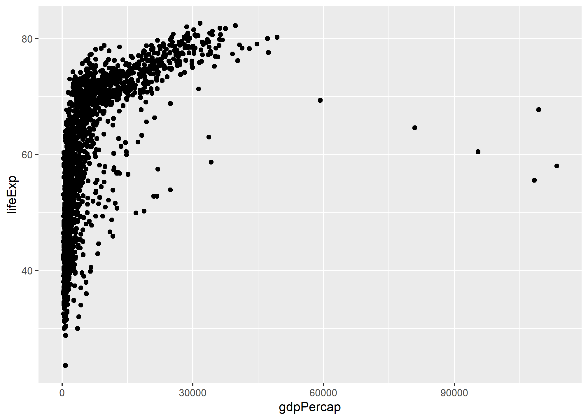
Above we’ve loaded a different dataset and have started to explore a particular relationship. Before putting in this code yourself, try to intuit what might be going on.
Any ideas?
Here’s a breakdown of everything that happens after the p<- ggplot() call:
data = gapmindertells ggplot to use gapminder dataset, so if variable names are mentioned, they should be looked up in gapmindermapping = aes(...)shows that the mapping is a function call. There is a deeper logic to this that I will disucss below, but it’s easiest to simply accept that this is how you write it. Put another way, themapping = aes(...)argument links variables to things you will see on the plot.aes(x = gdpPercap, y = lifeExp)maps the GDP data ontox, which is a known aesthetic (the x-coordinate) and life expectancy data ontoyxandyare predefined names that are used byggplotand friends
Exercise 1 of 3
Let’s return to the mpg data. Among the variables in mpg are:
displ, a car’s engine size, in litres.hwy, a car’s fuel efficiency on the highway, in miles per gallon (mpg). A car with a low fuel efficiency consumes more fuel than a car with a high fuel efficiency when they travel the same distance.
Generate a scatterplot between these two variables. Does it capture the intuitive relationship you expected? What happens if you make a scatterplot of class vs drv? Why is the plot not useful?
It turns out there’s a reason for doing all of this:
“The greatest value of a picture is when it forces us to notice what we never expected to see.”” — John Tukey
In the plot you made above, one group of points seems to fall outside of the linear trend. These cars have a higher mileage than you might expect. How can you explain these cars?
Let’s hypothesize that the cars are hybrids. One way to test this hypothesis is to look at the class value for each car. The class variable of the mpg dataset classifies cars into groups such as compact, midsize, and SUV. If the outlying points are hybrids, they should be classified as compact cars or, perhaps, subcompact cars (keep in mind that this data was collected before hybrid trucks and SUVs became popular).
You can add a third variable, like class, to a two dimensional scatterplot by mapping it to an aesthetic. An aesthetic is a visual property of the objects in your plot. Aesthetics include things like the size, the shape, or the color of your points. You can display a point (like the one below) in different ways by changing the values of its aesthetic properties. Since we already use the word “value” to describe data, let’s use the word “level” to describe aesthetic properties. Thus, we are interested in exploring class as a level.
You can convey information about your data by mapping the aesthetics in your plot to the variables in your dataset. For example, you can map the colors of your points to the class variable to reveal the class of each car. To map an aesthetic to a variable, associate the name of the aesthetic to the name of the variable inside aes(). ggplot2 will automatically assign a unique level of the aesthetic (here a unique color) to each unique value of the variable, a process known as scaling. ggplot2 will also add a legend that explains which levels correspond to which values.
Exercise 2 of 3
Using your previous scatterplot of displ and hwy, map the colors of your points to the class variable to reveal the class of each car. What conclusions can we make?
Let’s explore our previously saved p in greater detail. As with Exercise 1, we’ll add a layer. This says how some data gets turned into concrete visual aspects.
p + geom_point()
p + geom_smooth()Note: Both of the above geom’s use the same mapping, where the x-axis represents gdpPercap and the y-axis represents lifeExp. You can find this yourself with some ease. But the first one maps the data to individual points, the other one maps it to a smooth line with error ranges.
We get a message that tells us that geom_smooth() is using the method = ‘gam’, so presumably we can use other methods. Let’s see if we can figure out which other methods there are.
?geom_smooth
p + geom_point() + geom_smooth() + geom_smooth(method = ...) + geom_smooth(method = ...)
p + geom_point() + geom_smooth() + geom_smooth(method = ...) + geom_smooth(method = ..., color = "red")You may start to see why ggplot2’s way of breaking up tasks is quite powerful: the geometric objects can all reuse the same mapping of data to aesthetics, yet the results are quite different. And if we want later geoms to use different mappings, then we can override them – but it isn’t necessary.
Consider the output we’ve explored thus far. One potential issue lurking in the data is that most of it is bunched to the left. If we instead used a logarithmic scale, we should be able to spread the data out better.
p + geom_point() + geom_smooth(method = "lm") + scale_x_log10()Try it: (OPTIONAL) Describe what the scale_x_log10() does. Why is it a more evenly distributed cloud of points now? (2-3 sentences.)
Nice. We’re starting to get somewhere. But, you might notice that the x-axis now has scientific notation. Let’s change that.
library(scales)
p + geom_point() +
geom_smooth(method = "lm") +
scale_x_log10(labels = scales::dollar)
p + geom_point() +
geom_smooth(method = "lm") +
scale_x_log10(labels = scales::...)Try it: (OPTIONAL) What does the dollar() call do? How can you find other ways of relabeling the scales when using scale_x_log10()?
?dollar()The Recipe
- Tell the
ggplot()function what our data is. - Tell
ggplot()what relationships we want to see. For convenience we will put the results of the first two steps in an object calledp. - Tell
ggplothow we want to see the relationships in our data. - Layer on geoms as needed, by adding them on the
pobject one at a time. - Use some additional functions to adjust scales, labels, tickmarks, titles.
- e.g.
scale_,labs(), andguides()functions
As you start to run more R code, you’re likely to run into problems. Don’t worry — it happens to everyone. I have been writing code in numerous languages for years, and every day I still write code that doesn’t work. Sadly, R is particularly persnickity, and its error messages are often opaque.
Start by carefully comparing the code that you’re running to the code in these notes. R is extremely picky, and a misplaced character can make all the difference. Make sure that every ( is matched with a ) and every ” is paired with another “. Sometimes you’ll run the code and nothing happens. Check the left-hand of your console: if it’s a +, it means that R doesn’t think you’ve typed a complete expression and it’s waiting for you to finish it. In this case, it’s usually easy to start from scratch again by pressing ESCAPE to abort processing the current command.
One common problem when creating ggplot2 graphics is to put the + in the wrong place: it has to come at the end of the line, not the start.
Mapping Aesthetics vs Setting them
p <- ggplot(data = gapminder,
mapping = aes(x = gdpPercap, y = lifeExp, color = 'yellow'))
p + geom_point() + scale_x_log10()This is interesting (or annoying): the points are not yellow. How can we tell ggplot to draw yellow points?
p <- ggplot(data = gapminder,
mapping = aes(x = gdpPercap, y = lifeExp, ...))
p + geom_point(...) + scale_x_log10()Try it: (OPTIONAL) describe in your words what is going on.
One way to avoid such mistakes is to read arguments inside aes(<property> = <variable>)as the property
Try it: (OPTIONAL) Write the above sentence for the original call aes(x = gdpPercap, y = lifeExp, color = 'yellow').
Aesthetics convey information about a variable in the dataset, whereas setting the color of all points to yellow conveys no information about the dataset - it changes the appearance of the plot in a way that is independent of the underlying data.
Remember: color = 'yellow' and aes(color = 'yellow') are very different, and the second makes usually no sense, as 'yellow' is treated as data.
p <- ggplot(data = gapminder,
            mapping = aes(x = gdpPercap, y = lifeExp))
p + geom_point() + geom_smooth(color = "orange", se = FALSE, size = 8, method = "lm") + scale_x_log10()Try it: (OPTIONAL) Write down what all those arguments in geom_smooth(...) do.
p + geom_point(alpha = 0.3) +
  geom_smooth(method = "gam") +
  scale_x_log10(labels = scales::dollar) +
  labs(x = "GDP Per Capita", y = "Life Expectancy in Years",
       title = "Economic Growth and Life Expectancy",
       subtitle = "Data Points are country-years",
       caption = "Source: Gapminder")
Coloring by continent:
library(scales)
p <- ggplot(data = gapminder,
            mapping = aes(x = gdpPercap, y = lifeExp, color = continent, fill = continent))
p + geom_point()
p + geom_point() + scale_x_log10(labels = dollar)
p + geom_point() + scale_x_log10(labels = dollar) + geom_smooth()
Try it: (OPTIONAL) What does fill = continent do? What do you think about the match of colors between lines and error bands?
p <- ggplot(data = gapminder,
            mapping = aes(x = gdpPercap, y = lifeExp))
p + geom_point(mapping = aes(color = continent)) + geom_smooth() + scale_x_log10()
Try it: (OPTIONAL) Notice how the above code leads to a single smooth line, not one per continent. Why?
Try it: (OPTIONAL) What is bad about the following example, assuming the graph is the one we want? Think about why you should set aesthetics at the top level rather than at the individual geometry level if that’s your intent.
p <- ggplot(data = gapminder,
            mapping = aes(x = gdpPercap, y = lifeExp))
p + geom_point(mapping = aes(color = continent)) +
  geom_smooth(mapping = aes(color = continent, fill = continent)) +
  scale_x_log10() +
  geom_smooth(mapping = aes(color = continent), method = "gam")
Exercise 3 of 3
Generate two new plots with data = gapminder (note: you’ll need to install the package by the same name if you have not already). Label the axes and the header with clear, easy to understand language. In a few sentences, describe what you’ve visualized and why.
Note that this is your first foray into ggplot2; accordingly, you should try to make sure that you do not bite off more than you can chew. We will improve and refine our abilities as we progress through the semester.